Understanding OKLCH
OKLCH describes a color with three values: lightness (L), chroma (C), and hue (H). These values aim to follow how we perceive color, making visual adjustments more predictable. You can use them directly in CSS with oklch().
Different ways to describe color
To see what makes OKLCH useful, start with two ideas: how a color is described and which colors a display can reproduce.
A color model expresses color as a set of values. You may already work with RGB, HSL, LCH, or OKLCH. Each gives you a different set of controls, which shapes how you choose and adjust colors.
Which colors can a display show?
A gamut is a range of reproducible colors. Two common examples are sRGB, the familiar baseline for web content, and Display-P3, which reaches more vivid colors on compatible screens.
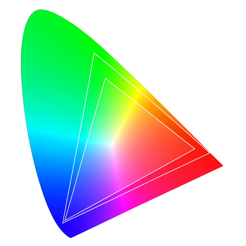
A color space specifies more than this range. It also defines details such as its white point and how encoded values relate to light, known as its transfer function.
Reading an OKLCH value
OKLCH and LCH both use lightness, chroma, and hue. Their values come from different underlying color spaces. OKLCH is the cylindrical form of Oklab.
Lightness: how light or dark a color appears. Use a number from 0 to 1, or a percentage from 0% to 100%.
Chroma: how colorful a color is. Zero gives you a neutral gray; higher values increase its intensity.
Hue: the color’s position around a circle, expressed as an angle. A full turn is 360 degrees, bringing you back to the starting hue.
Balancing colors across a palette
Imagine a set of buttons in different colors. You want each to carry a similar visual weight, but matching them by eye can take several rounds of adjustment.
With OKLCH, start with a shared lightness and chroma, then vary the hue. The resulting colors tend to feel more balanced, giving you a useful starting point for a palette.
Try the same approach in HSL. As the comparison shows, equal lightness values do not necessarily look equally light. Some hues stand out much more than others.
That perceptual consistency is a practical reason to choose OKLCH. It reduces the guesswork involved in building a palette whose colors feel related.
Building a range of shades
To build lighter and darker shades of a color, adjust lightness while keeping hue and chroma fixed. Within the available gamut, this helps preserve the color’s character across the range.
Compare the two blue scales above. The OKLCH scale keeps a more consistent sense of blue, while the HSL scale shows more variation in how the hue and intensity appear as the shades get lighter or darker.
How gradients travel between colors
A gradient’s intermediate colors depend on the color space used to mix its endpoints. An OKLCH gradient can look quite different from an RGB gradient, where mixing red, green, and blue channels can produce a dull midpoint or uneven lightness.
In OKLCH, interpolation changes lightness, chroma, and hue. The comparison uses identical endpoints, so any difference you see comes from the route between them.
That route may pass through hues you did not expect. In OKLCH, hue follows a circle, so moving between two colors can introduce a whole sequence of hues along the way.
For a different result, try interpolating in Oklab. It takes a straight path through its color coordinates instead of following the hue circle, which can make the transition easier to anticipate.
Going beyond sRGB
Some screens can reproduce colors beyond the sRGB range. With OKLCH, you can specify these wider-gamut colors too, including those available on Display-P3 screens.
On a Display-P3 screen, the swatches on the right can look more vivid. On an sRGB screen, the two sets may appear almost the same because the browser has to bring unsupported colors into the display’s range.
The wider gamut adds room for more colorful shades. Neutral grays do not gain extra intensity in Display-P3.
Finding the chroma limit
OKLCH values can describe colors beyond a display’s capabilities. Valid CSS does not guarantee that a color fits inside sRGB or Display-P3.
Consider oklch(0.7 0.4 40). Its chroma of 0.4 places it outside both sRGB and Display-P3 at this lightness and hue.
The browser must bring an unsupported color into the available gamut through clipping or gamut mapping. What you see is a representable substitute.
@layer base {
  :root {
    color: oklch(0.7 0.4 40);
  }
}
This adjustment can change the appearance you intended. Checking the gamut helps you spot those changes before relying on a color in your design.
Maximum chroma is the highest chroma that fits within a chosen gamut for a given lightness and hue. Change any of those conditions and the limit changes too.
The colored band runs through the hues at a single lightness. Each line shows a gamut’s chroma limit; values above it need to be mapped or clipped. Adjust lightness to see how those limits shift.
Using OKLCH with CSS fallbacks
OKLCH is defined in CSS Color Module Level 4. For environments that do not recognize the syntax, provide a fallback color.
Start with an sRGB color, then add your OKLCH value inside an @supports rule. This lets the browser select the version it understands.
@layer base {
  :root {
    /* sRGB hex */
    --color-gray-50: #fcfcfc;
    --color-gray-100: #f9f9f9;
    --color-gray-200: #f0f0f0;

    @supports (color: oklch(0 0 0)) {
      /* OKLCH */
      --color-gray-50: oklch(0.991 0 0);
      --color-gray-100: oklch(0.982 0 0);
      --color-gray-200: oklch(0.955 0 0);
    }
  }
}
Browsers that pass the feature check apply OKLCH; the others keep the sRGB fallback. The notation itself does not make a color more vivid. An OKLCH color within sRGB looks the same as its equivalent hex value.